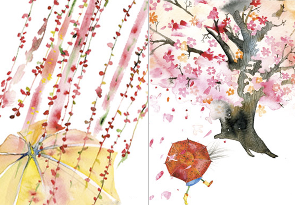
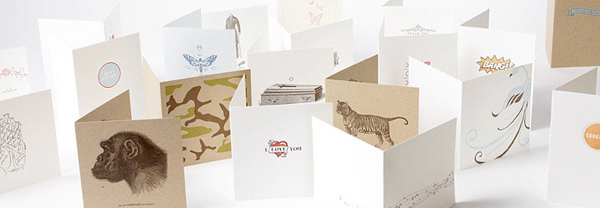
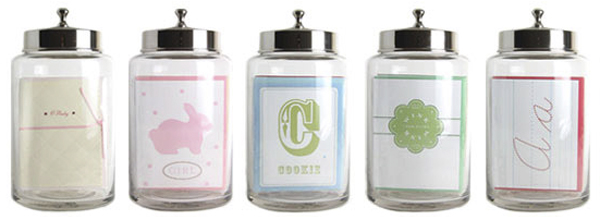
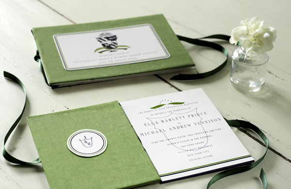
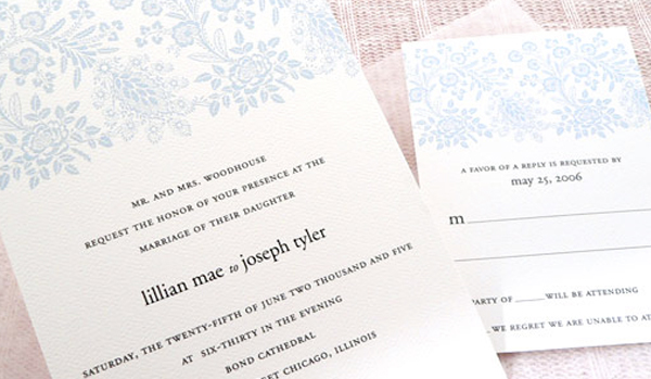
Archive for the ‘Stationery’ Category

Apiary Design

All of Apiary‘s designs are printed with raised ink. The effect is quite luscious and only makes the patterns and colors pop even more. Announcements with color combinations, patterns and name plates are available for purchase but you may also choose your own combinations to suit your needs. Great patterns here. Very gorgeous effect.

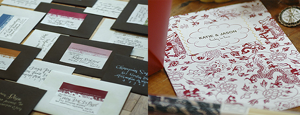
Envelopes and an announcement from Apiary.

Masha D’Yans

The work of Masha D’Yans caught my eye at the Stationery Show for the quality of color and brushwork alone. She had the above right displayed quite large and it was such a breath of fresh air. Be sure to visit her and see the rest because the above is not even the best of what she has. So hard to choose! Gorgeous stuff.

Two Everyday Cards from Masha.

Seraph

The visual aesthetic at Seraph is modern yet elegant with great typography and fantastic illustrations. Check out the fashion and the animal illustrations. The colors are layered beautifully as well.

An assortment of cards that may be purchased at Seraph's online store.

Patisserie Card Co.

The Patisserie Card Co.‘s booth was so adorable and was designed with a traditional patisserie in mind. The work is so sweet and playful. A lot of it reminds me of icing on cookies and old fashioned cookie and candy packaging. Beautiful work.

Adorable candy jars holding some of Patisserie Card Co. cards.

Mr. Boddington

The work of Mr. Boddington has a very old world style. Wax seals, hand calligraphy, presidential looking design are a part of the feel of the studio. Overall a very stately yet fun effect. The work shown in the booth was incredibly tactile with quirky typography from both typefaces and hand lettering. This booth was one of my favorites.

Croquet uses a linen cover and letterpressed printing.

Que Stien

The work at Que Stien is so delicate with beautiful and intricate borders and detailed illustrations of botanicals. Great colors… it’s what I remember most about this booth. I also remember the fantastic quality and crispness of printing. Gorgeous stuff.

Dinah, prices vary based on quantity and components ordered.

Priya is twenty-nine. She lives in New York City. She art directs advertising for a luxury jewelry brand. She loves fizzy lemonade, Ladurée macarons, Jean Schlumberger jewels, vintage fashion advertising, Audrey Hepburn movies and letterpressed paper. She also loves her work.

Archives by Month

  • 2014:
  • Jan
  • Feb
  • Mar
  • Apr
  • May
  • Jun
  • Jul
  • Aug
  • Sep
  • Oct
  • Nov
  • Dec
  • 2012:
  • Jan
  • Feb
  • Mar
  • Apr
  • May
  • Jun
  • Jul
  • Aug
  • Sep
  • Oct
  • Nov
  • Dec
  • 2011:
  • Jan
  • Feb
  • Mar
  • Apr
  • May
  • Jun
  • Jul
  • Aug
  • Sep
  • Oct
  • Nov
  • Dec


Colophon

I like to share the things that catch my eye. I hope you find as much inspiration in this as I do.

Love Made Visible was designed by me and coded by the fabulous Arun Kale and Stefan Pause. Typefaces used are Archer, Coquette, FF Meta Serif and Museo Sans.

Love Made Visible is a member of the Delightful Blogs Network.

Contact me or suggest a tip!