Cheree Berry

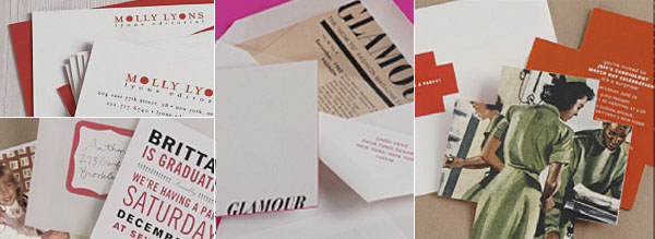
Totally sweet and proper retro style paired with gorgeous illustrations sets Cheree Berry apart. Cheree Berry used to work for Kate Spade before striking out on her own and there’s no denying her style is all hers. The color quality is amazing as is the level of detail in the illustrations she uses. Overall stunning, absolutely stunning work.

Stationery and announcements.

Comments

One comment
  1. Alex Johnson

    Love the beautiful letterpress work featured here! The attention to detail in Cheree Berry’s designs is truly inspiring. The color combinations and typography are exquisite.

    September 9th, 2026

Make a Comment

Priya is twenty-nine. She lives in New York City. She art directs advertising for a luxury jewelry brand. She loves fizzy lemonade, Ladurée macarons, Jean Schlumberger jewels, vintage fashion advertising, Audrey Hepburn movies and letterpressed paper. She also loves her work.

Archives by Month

  • 2014:
  • Jan
  • Feb
  • Mar
  • Apr
  • May
  • Jun
  • Jul
  • Aug
  • Sep
  • Oct
  • Nov
  • Dec
  • 2012:
  • Jan
  • Feb
  • Mar
  • Apr
  • May
  • Jun
  • Jul
  • Aug
  • Sep
  • Oct
  • Nov
  • Dec
  • 2011:
  • Jan
  • Feb
  • Mar
  • Apr
  • May
  • Jun
  • Jul
  • Aug
  • Sep
  • Oct
  • Nov
  • Dec


Colophon

I like to share the things that catch my eye. I hope you find as much inspiration in this as I do.

Love Made Visible was designed by me and coded by the fabulous Arun Kale and Stefan Pause. Typefaces used are Archer, Coquette, FF Meta Serif and Museo Sans.

Love Made Visible is a member of the Delightful Blogs Network.

Contact me or suggest a tip!