Matthew Curry

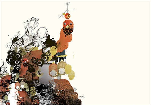
Graffiti influences and a dark, gritty feeling is what I think of when I see Matthew Curry‘s work. Great colors and form. Love the drips and drabs of paint and the quality of the brush strokes. MakingRoom Magazine has a great interview with Mr. Curry and he explains his process. His process is further illustrated in the step-by-step gallery of one of his works in the article.

A painting of Matthew's from MakingRoom Magazine.

Comments

No comments

Make a Comment

Priya is twenty-nine. She lives in New York City. She art directs advertising for a luxury jewelry brand. She loves fizzy lemonade, Ladurée macarons, Jean Schlumberger jewels, vintage fashion advertising, Audrey Hepburn movies and letterpressed paper. She also loves her work.

Archives by Month

  • 2014:
  • Jan
  • Feb
  • Mar
  • Apr
  • May
  • Jun
  • Jul
  • Aug
  • Sep
  • Oct
  • Nov
  • Dec
  • 2012:
  • Jan
  • Feb
  • Mar
  • Apr
  • May
  • Jun
  • Jul
  • Aug
  • Sep
  • Oct
  • Nov
  • Dec
  • 2011:
  • Jan
  • Feb
  • Mar
  • Apr
  • May
  • Jun
  • Jul
  • Aug
  • Sep
  • Oct
  • Nov
  • Dec


Colophon

I like to share the things that catch my eye. I hope you find as much inspiration in this as I do.

Love Made Visible was designed by me and coded by the fabulous Arun Kale and Stefan Pause. Typefaces used are Archer, Coquette, FF Meta Serif and Museo Sans.

Love Made Visible is a member of the Delightful Blogs Network.

Contact me or suggest a tip!