Hermès Peony Tea Set

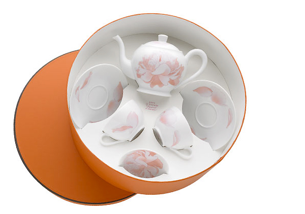
I love Hermès. In case you couldn’t already tell. Popped over there following a link in my inbox and found the adorable Peony Tea Set. The teapot and cups are so perfectly proportioned with beautiful illustrations of peonies, my official favorite flower of the moment. Perfect gift for mother. Or yourself. Gorgeous.

Ane Christensen

Ane Christensen works with various metals that she molds and shreds to form bowls and other vessels that explore negative space and optical illusions. (Refer to the above for a perfect example of this.) Her Fruit Bowls are wonderfully shredded and seem to be made of the most delicate of paper. Her Ribbon Series are so gracefully elegant and appear to defy gravity. Totally beautiful work.

Negative Bowl patinated copper 2005.

Musical Chairs

Jenifer has turned me onto Barbara Barry’s line of fine china for British china maker Wedgwood. Her design called “Musical Chairs” features white china with black trim and a graphic image of a chair. So simple and clean. The shot is just a preview of the to-be-released collection which will launch in Fall 2006. Lovely.

Barry's Musical Chairs.

Julie West

The work of Julie West is available for purchase at her online shop Sno. For sale are limited edition giclee, serigraph and gocco prints as well as stationery and tote bags. Her work has great line quality and the papers she uses to print are all gorgeous. Each gocco print, for example, is printed on its own unique sheet of paper. No two prints are alike.

Deth P. Sun

I was framing a bunch of Tiny Showcase prints last night and remembered the work of Deth P. Sun. The work in general is dark yet playful with great color combinations (love that bright fuschia with the dove gray.) and reminds me of the work of Maurice Sendak.

Like Whoa, a painting by Deth P. Sun.

On the Sea Floor

Flipping through back issues of Martha Stewart and found this beautiful seaside-inspired bathroom. The sealife is actually découpaged illustrations taken from a clipart book. The layers of paper give each illustration a great texture. Beautiful.

Click the above to see the full bathroom. From the September 2002 issue of Martha Stewart Living

Priya is twenty-nine. She lives in New York City. She art directs advertising for a luxury jewelry brand. She loves fizzy lemonade, Ladurée macarons, Jean Schlumberger jewels, vintage fashion advertising, Audrey Hepburn movies and letterpressed paper. She also loves her work.

Archives by Month

  • 2014:
  • Jan
  • Feb
  • Mar
  • Apr
  • May
  • Jun
  • Jul
  • Aug
  • Sep
  • Oct
  • Nov
  • Dec
  • 2012:
  • Jan
  • Feb
  • Mar
  • Apr
  • May
  • Jun
  • Jul
  • Aug
  • Sep
  • Oct
  • Nov
  • Dec
  • 2011:
  • Jan
  • Feb
  • Mar
  • Apr
  • May
  • Jun
  • Jul
  • Aug
  • Sep
  • Oct
  • Nov
  • Dec


Colophon

I like to share the things that catch my eye. I hope you find as much inspiration in this as I do.

Love Made Visible was designed by me and coded by the fabulous Arun Kale and Stefan Pause. Typefaces used are Archer, Coquette, FF Meta Serif and Museo Sans.

Love Made Visible is a member of the Delightful Blogs Network.

Contact me or suggest a tip!