Brooklyn Circus Lookbook

Loving the new lookbook from Brooklyn Circus featuring a lot of hand lettering by the crazy talented Jon Contino. Gorgeous photos and illustration throughout. Typography is so beautiful… and that quote is one to live by as a designer. (via FWMJ)

Top: Spread for the Brooklyn Circus Lookbook. Bottom: hand drawn lettering by Jon Contino as seen in the look book.

A Love Letter For You

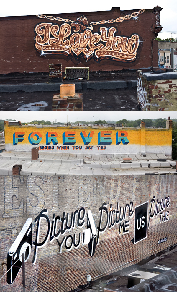
Again, I’m so late to the game but I love this public arts project in West Philadelphia. Artist Stephen Powers (a.k.a. ESPO) painted murals above the SEPTA line along Market Street from 63rd to 45th in a public arts project called “A Love Letter For You.” Each mural reads as a love story to West Philly from residents of the neighborhood.

The typography is so beautiful and I love how some are very site specific. (Like “I’ll Shape Up” on the side of a building that houses a barber shop.) See all 50 murals on the official site gallery. (via Pixels & Arrows)

Murals from the public arts project "A Love Letter For You."

Daily Drop Cap

Type Queen Jessica Hische has started a great blog called Daily Drop Cap as a daily typographic exploration. Each work day she will post a decorative drop cap for free use on blog posts. She’s got the first three letters of the alphabet up so far and I can’t wait to see more from her!

The first three offerings from Jessica Hische's new blog Daily Drop Cap.

Rustic & Gorgeous from The Perky Bros.

I cannot get over the typography. I am absolutely floored by this wedding invitation set produced by the amazing Studio on Fire and designed by the super talented groom Jefferson Perky of Perky Bros. The invite was offset with the wood grain pattern and then the type was letter pressed. A save the date, invite, accommodations card, custom belly band and thank you card were produced. See more of this suite on Beast Pieces.

Wedding invitation by Perky Bros. and produced by Studio on Fire.

Cardon Copy

Jordan posted today about her friend Cardon Webb whose exhibition, Cardon Copy, is at the Type Directors Club right now in NYC. I loved the typography so much… I also noticed that some of the posters seem to be from my neighborhood in Queens!

From his mission statement: “Cardon Copy, takes the vernacular of self-distributed fliers and tear-offs we have all seen in our neighborhoods. It involves hijacking these unconsidered fliers and redesigning them, over powering their message with a new visual language. I then replace the original with the redesign in its authentic environment.”

Cardon Copy

Vintage Beer Cans

There is a great set of vintage beer cans up on Flickr by Lance Wilson. Lance told the blog TheDieline that the cans are a “… portion of an extensive beer can collection (2000+ cans) containing cans from the past 70 years …”

Amazing how far the packaging and typography has come. Loving the tag lines too: “The beer with the million dollar flavor.”

Selections from Lance Wilson's collection of vintage beer cans.

Vintage Epherma

Flickr user Daily Poetics has a fantastic set of photographs of vintage epherma. Old school typography makes me happy. (via Twig & Thistle)

Vintage calling cards!

Louise Fili

The insanely talented Louise Fili has just launched her new website and has updated her portfolio to include lots of her newer work. Needless to say, it’s totally gorgeous. I especially loved the identity she designed for the restaurant Bedford Post. (pictured above) The typography alone is gorgeous and the postage stamp illustration is so beautiful.

Also launched is a blog which is sure to be a new daily read for me! (via Jessica Hische)

Identity for Bedford Post is based on an illustration of the owner's grandfather.

Calligraphy Inspiration

I’ve just been obsessing over this archive ever since 100 Layer Cake’s post on Friday. IAMPETH is the International Association of Master Penmen, Engrossers and Teachers of Handwriting. Their official website showcases historic specimens of their members’ work as well as gorgeous scans of rare books. Can’t get enough.

From Studies in Pen Art, W.E. Dennis, 1914.

Vintage Typewriter Ribbon Tins

Loved these ribbon tins that Janine Vangool collects. She has a full flickr set of her collection up… I loved all the typography! (via Poppytalk and T:Style)

Tins from Janine's collection.

Meli & Angi

When my friend Jina told me about Meli & Angi, I was absolutely floored. Jina was also kind to remind me that they baked the cookies from her wedding and I immediately remembered the deliciousness.

The precise lettering is so amazing. Check out the monogrammed cookies they can make for weddings! Total icing perfection.

Onesie, Bottle and Button cookies from Meli & Angi.

Love, Jenna

Saw Jenna’s calligraphy via Brooklyn Bride. Jenna has done work for Anthropologie and Real Simple. She’s based in Brooklyn. Loved the carefree swoopy curves.

From Jenna's portfolio.

Priya is twenty-eight. She lives in New York City. She art directs advertising for a luxury jewelry brand. She loves fizzy lemonade, Laudrée macarons, Jean Schlumberger jewels, vintage fashion advertising, Audrey Hepburn movies and letterpressed paper. She also loves her work.

Archives by Month

  • 2010:
  • Jan
  • Feb
  • Mar
  • Apr
  • May
  • Jun
  • Jul
  • Aug
  • Sep
  • Oct
  • Nov
  • Dec


Colophon

I like to share the things that catch my eye. I hope you find as much inspiration in this as I do.

Love Made Visible was designed by me and coded by the fabulous Arun Kale. Typefaces used are Archer, Dalliance, Georgia and Arial.

Love Made Visible is a member of the Delightful Blogs Network.

Contact me or suggest a tip!