Deborah’s Great Space
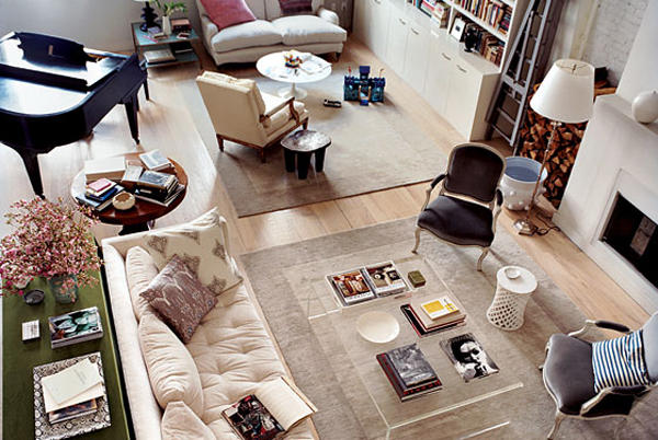
Caught Domino‘s Editor-in-Chief Deborah Needleman’s Tribeca home in this week’s New York Magazine and loved it so much. That living room is to die for and oh, dear the gray on the walls of her dining room is sublime. I love how everything looks so light and airy and yet so comfortable. See it all here. (And check out the rest of the issue… this week is the Home Design issue!)
Deborah Needleman's living room.
Very pretty.
May 17th, 2007stunning. elegant. quiet. wow.
May 18th, 2007I too loved Deborah Needleman’s eclectic use of vintage furniture mixed with contemporary pieces thatare truly practicle in modern living. It actually looks as if someone who lives there reads and burns fire in the fireplace.
I was also wondering if you might be interested in a reciprocal link to our website and blogs. http://www.blinkdecor.com/decoratorsdish/ or http://www.blinkdecor.com/renovatorsroundtable.com/. Thanks for your consideration.
May 20th, 2007oh i loved this shot too… and the little loveseat in the corner is my dream one. i wonder where it is from??
May 20th, 2007Hi. Your blog is great ! Are you interesting in a link exchange with my blog ?
May 26th, 2007Marina
Love the airy, natural light, spacious feel of this place. The ceiling must be high, it’s a wonderful photo too.
June 7th, 2007Picture is completely incredible,its perfection ,The room is so incredibly fabulous! Love it! great job on every detail.looks so elegant and airy feeling.thanks its nice post!
July 22nd, 2010